Preparing the Opening Shot
Today has been really fun and productive. I worked on the opening scene for the film. I wanted it to be unique and eye-catching. I have a very similar shot planned for another video, but I'm giving it a go in this project.
I used a popular font for programmers, accountants, and other professionals doing technical work; DejaVu Sans Mono. I chose this font because it fit the overall theme. The film is about a software engineer and this font is made for fields like that.
I am really inspired by retro aesthetics and an old CRT monitor that I had laying around from my childhood gave me the perfect opportunity to incorporate that aesthetic into this film.
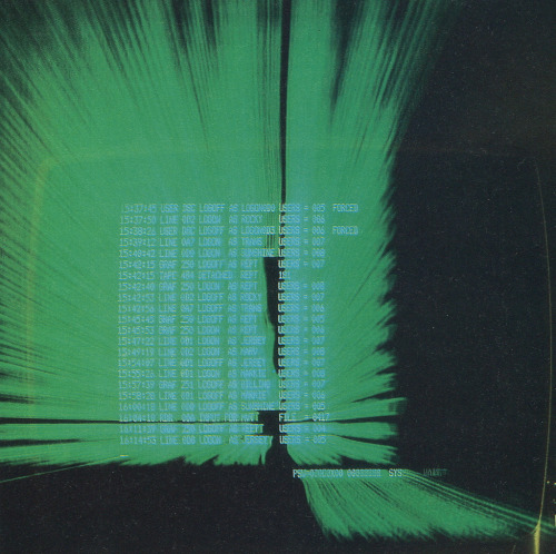
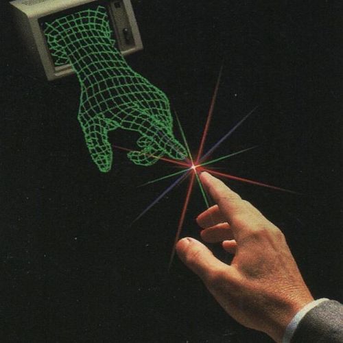
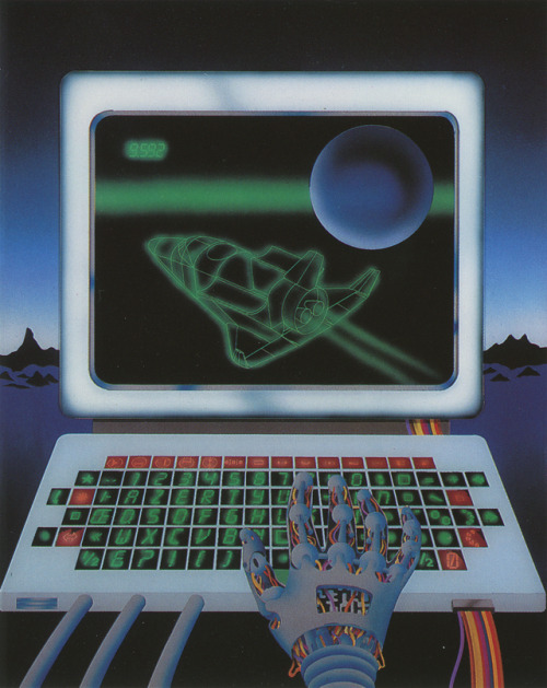
Examples of "Retro aesthetics" in relation to CRT monitors:
The old monitor reminded me of computer terminals from the '90s and how those computers used green text with similar fonts. So I decided to use a neon green colour (#39FF14 to be exact) for the text to keep consistency.
When I rendered the project out from After Effects, the file ended up coming out as 988 MB .avi file, despite being a simple text reveal on a black background! After 5 minutes of trying to figure out how to prevent this from happening, I was unable to figure out a solution, so I just took the .avi file, dropped it into Premiere Pro, then rendered it out as a .mp4 file to compress the file and save a ton of valuable space on my hard drive.
I used a popular font for programmers, accountants, and other professionals doing technical work; DejaVu Sans Mono. I chose this font because it fit the overall theme. The film is about a software engineer and this font is made for fields like that.
I am really inspired by retro aesthetics and an old CRT monitor that I had laying around from my childhood gave me the perfect opportunity to incorporate that aesthetic into this film.
Examples of "Retro aesthetics" in relation to CRT monitors:
The old monitor reminded me of computer terminals from the '90s and how those computers used green text with similar fonts. So I decided to use a neon green colour (#39FF14 to be exact) for the text to keep consistency.
A VT510 terminal from 1993
I watched this tutorial on YouTube and learned how to make it seem like text is being typed out. Then I tried to replicate what was shown in the tutorial with my own spin to it. This was the result of the preliminary task
I made a text cursor for added realism. I roughly estimated the blinking to be at a tempo of 118 BPM. That roughly makes 1 blink every second. To keep consistency with realism, I made my cursor blink at that speed. I had to animate every keyframe to make it perfect. It was tedious, but rewarding in the end...
When I rendered the project out from After Effects, the file ended up coming out as 988 MB .avi file, despite being a simple text reveal on a black background! After 5 minutes of trying to figure out how to prevent this from happening, I was unable to figure out a solution, so I just took the .avi file, dropped it into Premiere Pro, then rendered it out as a .mp4 file to compress the file and save a ton of valuable space on my hard drive.
The size of the new file was 380 KB, which made a lot more sense than nearly 1 GB...
Lastly, I filmed a test shot to get an idea of what the results might look like in the end. I'm not satisfied with the flickering and the framing of the shot, but this is about as much as I am willing to do for the day. I will be fixing the problems in the coming days...


Comments
Post a Comment